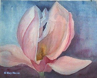
Texture Tricks
Look for certain elements to create lifelike textures. We've listed 3 of them for you.
Cheryl Criss
To create texture with the pulling, pushing and dragging techniques, it's imperative that your brush, the paint on your paper and your palette mixture are all the correct dampness. Here's what to look for: The brush must be slightly damp to the touch, the bristles on the very end should be splayed and you shouldn't be able to squeeze any water from the brush. The paint on the paper shouldn't have any shine to it and you should be able to stand the painting upright on an easel without the paint running. The paper should also feel cool to the touch. Any additional paint that you'll be adding to the paper, such as a mixture you've prepared on your palette, shouldn't be too juicy. In other words, you must maintain the same dampness of your brush, paper and paint; otherwise you'll be creating havoc.
3 Media to Try
Try a different medium to challenge yourself and expand your artistic capabilities. These three media are good options to explore.
Tom Zeit
Watercolor Pencil
By Cathy Johnson
What it is
Sometimes called watersoluble pencils, they're pure pigment that dissolve in water. They're usually encased in wood, but some brands are "all lead," meaning that the entire pencil is pigment, covered with a varnish or paint film to keep your fingersand your artclean. Some watercolor pencils are hard; others are soft and buttery. Some have intense, rich pigmentation; others have less and are more suitable for sketching than painting. Finally, some dissolve more readily in water than others.
Why you should try it
Because it's simple but not too simple. Today's best watercolor pencils are a truly fineart medium, with a pigment quality every bit as high as in watercolors. But they have the advantage of being highly portable, and they're wonderfully versatile, as well. You can use them as a sketching medium and wet the lines down later, leave them dry as a colored pencil drawing, or build layers in a painterly fashion for extremely rich works. You can work on the spot, en plein air, with only the addition of a brush or two and a container of water. When sharpened, the fine points of the pencils can create linear effects that are difficult to get with a brush.
Oil Pastel
By John Elliot
What it isTopquality, ground color pigment with just enough binder to hold together as a stick. Unlike dry pastel, oil pastel stays put on the painting surface and doesn't dust off. Otherwise, oil pastel is a true pastel in that it doesn't create a surface skin like oil paint, and it shouldn't be confused with oil sticks, which are oil paint in stick form.
Why you should try it
They're dustless, nontoxic and versatile. They go on virtually any surface, including smooth surfaces lacking tooth. They're fabulous for mixedmedia work, they're portable and they're immediate-what you see is what you get. They're also durable, and if you use stable materials and commonsense framing and storing procedures, oil pastels are among the longest lasting art materials available.
Watermiscible oils
By Sean Dye
What it is
Oil paint that can be thinned or cleaned up with water. Paint manufacturers have developed ways for oil and water to mix in the form of an emulsion temporarily while painting, similar to the mixing of oil, water and vinegar in salad dressing. Once the painting dries, the paint film becomes very similar (if not identical) to that of traditional oil.
Why you should try itWatermiscible oils let you experience oil painting without the danger, hassle or inconvenience of solvents, a great opportunity for art educators, artists with poorly ventilated studios and those who paint at home to avoid ventilation and disposal issues. Unlike fast drying acrylics, watermiscible oils stay wet on the palette for hours, even in arid climates.
Shooting Better Slides
Six tips for top-quality slides.
Ann Abbott
When you send slides to galleries and competitions, you want them to be the highest possible quality so they garner the kind of attention your artwork deserves. Here are some criteria to shoot for:
Color quality. The color visible in the slide must match the color in the original work, especially if the slide will eventually be reproduced.
Maximum size. Artwork is rarely proportional to the image area of the camera lens, so make sure the longest side of the artwork--excluding the framefills the longer edge of the image area.
Plain background. Place a solid-colored backdropnot a distracting object or printed background fabric behind the artwork.
Squared up. The surface of the artwork needs to be exactly parallel to the camera lens. If it's not, you'll create a distortion known as parallax, in which the artwork appears to be narrower at the top or bottom, or one side seems shorter than the other.
Clarity. The images should be sharp and in focus.
Proper lighting. A well-lit, properly exposed slide shows no sign of glare or "hot spots," and isn't overly light or dark.
If you're unable to create the best quality slides, hire a professional who has the knowledge and equipment to do the job right. And keep your files well-stocked by ordering duplicate copies when you're having the originals processed.
A Tax Tip
How to calculate your home-office deduction.
Jennifer Gilbert
If you're in business and you work out of your home, you may be able to expense part of your rent or mortgage as well as utilities for your "at-home office." But the IRS is extremely strict about this expense. Your office or studio must be in an identifiable area in your home not used for any other purpose than creating, selling or storing your art. To calculate your studio expense, measure its space and then divide it by the total floor space in your home. The resulting percentage is then applied to your rent or mortgage. The same formula may be used for your utility and real-estate tax expenses.
A Handy Helper
Three uses for rubbing alcohol.
Francis Vecchiarelli
Rubbing (or isopropyl) alcohol can serve a surprising number of purposes in the studio, including:
General clean up. Rubbing alcohol is an excellent solvent and I use it for many jobs where soap and water doesn't quite do the trick. The odor is mild and not offensive, and it's ecologically neutral.
Watercolor special effects. When used in lieu of water, alcohol creates interesting effects with watercolors. The colors spread and "wet" much differently. And they're markedly more granular on the surface.
Pastel blending. Use a small, alcohol-loaded synthetic brush to blend pastels on the painting surface. You can also use an alcohol-laden brush to pick up a dab of color from a stick of pastel, which you can use for corrections, touch-ups and light strokes of color.
For dispensing small amounts, keep a bit of alcohol in a small squirt bottle or eye-dropper bottle. But protect your good brushes by applying it with a synthetic brush or cotton swab.
Your Creative Toolbox
7 things to help you be creative anytime.
By Ann Emmert Abbott
To be creative on the fly, you must have a few items close at hand.
At least one good sketchbook or two would be better. Leave one by the phone or at home for doodling; carry one with you for whenever the doodling urge strikes.
A good pencil for sketching. Vine charcoal is also an easy-to-use tool.
A gum eraser.
At least one good pen for sketching. The kind of pen you like varies from person to person. Some people like felt-tip pens with a medium tip, some like a fine or an extra-fine tip. Some people like gel-roller pens. Some people even like ballpoint pens. You may even want to spring for a specialty pen with a special nib made for sketching.
A set of watercolors for embellishing notes and letters to friends and family.
A small, bound watercolor sketchbook for field sketching.
Watercolor paper to cut into note cards, or specially made watercolor paper cards.
Keep 'em Coming Back
2 ways to get your customers to buy more art.
By Kathy Gulrich
1. Make it easy for your customers to purchase more of your work.
I was at a friend's house recently and admired a beautiful handmade journal she'd purchased at a local craft fair. Thinking it would make a perfect gift for another friend, I asked for the artist's name. When she didn't remember, we looked inside the journal and discovered the artist's name and phone number were nowhere to be found. The result? He or she lost a sale.
Put your contact information on everything that leaves your studio: letterhead, invitations, show announcements, note cards, etc. Affix a personalized label on the back of each painting that includes your name, plus your e-mail address or Web site.
And send your new collectors home with an "Artist Pack": a professional-looking folder with your business card, résumé, artist statement, bio, articles about you and by you, and so on. You'll be amazed at how often your customers will share this information with their friends and associates.
2. Ask for another sale.
When liquid shampoo first came out, it gave consumers a convenient and easy way to wash their hair. "Lather and rinse," the label said. But shampoo sales really took off when just one simple word was added. Your shampoo bottle now says, "Lather, rinse and repeat if desired."
Repeat sales can revolutionize your business, too. So display your work in your home and studio where visitors will see it. And when customers are making a purchase, be bold: Ask them whether they'd like to purchase a second (or third) piece. Ask your collectors for referrals to another collector or to a shop or gallery where they think your work might fit in. Or suggest a commissioned piece you'd like to do for them. The key here is to ask for the sale.
The Keys to Vibrant Watercolor
By Jack Hines
More than anything, I like color and light. The vibrancy in my paintings comes from this and I like painting directly. The vibrant tones are more part of my personality, and that comes through in my paintings.
I don't use earth tones like raw umber or burnt sienna. They are made of dirt and they look like dirt. One of the problems is that people begin to use them instead of mixing darks that contain color. The result is a lot of "no color" color in the dark passages of a painting. Earth tone darks cause the most problems when a painting is built around a lot of dark colors framing a light or dramatic spot. You wind up with a dirty-looking painting.
The classic way to mix a dark color is to mix across the color wheel, using complements. You can take a color like violeta deep value statement to start with and mix it with yellow ochre, or an orange even. When you mix the cool violet with its warm complement or near-complement, you'll find yourself getting a pretty strong dark. There are variations on this theme if you take Prussian blue and introduce one of the warms into that, you'll get a similar dark. Mix Prussian blue and alizarin crimson, and you make black. The most important thing is that the process will give you a dark that is made of color, and it show- it's not just a dead black, or a colorless earth tone.
I like to see as much pure color laid down as possible, but at the same time I think one of the most important words in the whole field of art is contrast. It's the whole yin yang principle, the two parts that form a perfect whole. When I lecture on the laws of light in my workshops, I emphasize that there is only one device you can use to depict light, and that's dark. In color, opposites are important, moorage never looks as orange as it can unless it's next to a blue or a blue green. It's so important to maintain that element of contrast all the way through your thinking, whether you're considering composition, color or value, or even paint strokes when you have to decide whether to lay down a sharp-edged, clean, clear calligraphic statement or a soft, wet entry. I cannot say it enough: Contrast is important.
When my wife (Jessica Zemsky) and I were teaching workshops, one of the things we emphasized was the importance of using quality materials. Any skimping on this, whether it's brushes, paint, paper or whatever, is putting yourself in a severely penalized situation. It's almost impossible to pull decent artwork out of trashy materials. That may sound simplistic, but it's amazing how often we ran into problems with cheap materials when we were teaching. Students would show up at these workshops, having devoted themselves to all this travel and putting out all this money to get to these classes, and they would pull out cheap, student-grade materials! It would be a disaster. We always had to keep extra material on hand to fill in the gaps for people like that.
It's simple: You have to use the best paints to capture color and light. The cheaper paint is so diluted down that the paint loses its ability to give you that quality.
A Good Mystery
By losing some of the detail and encouraging the viewer to imagine what is missing, the painting becomes a little more mysterious.
from Watercolor for the Fun of It: Getting Started by John Lovett
Background Check
When painting the background, don't make it so bust that it distracts from the center of interest. There should be enough happening to maintain interest and guide the eye to the focal point without causing distraction or confusion.
from Watercolor for the Fun of It: Getting Started by John Lovett
Maintaining Composure
A good painting begins with a good drawing. It's worth putting in the time at the start of a project to create a balanced composition and a well though-out plan.
from Wonderful Watercolors With Paul Brent
Are You Experienced?
Truly, each painting is the product of all your experience put together.
from Wonderful Watercolors With Paul Brent
Extra Pounds
Large pieces of 140-lb (300 gsm) paper can warp because paper expands when wet. To prevent warping, we the paper and tape it to the board. Then let it dry so it stretches as it dries...I just prefer to use 300-lb. (640 gsm) paper. The heavier weight makes it less likely to warp.
from Wonderful Watercolors With Paul Brent
Slides of the Future
Making slides from digital images.
By Jennifer Ball
Q. I recently took high-resolution pictures of my artwork on a digital camera. Unfortunately, the contest I want to submit my piece to requires that I send in a slide of my work. It took so much time to shoot the piece right the first time that I don't want to retake the pictures. Is it possible to get slides made from digital images? I've asked some local photo shops, but they're not sure.
A. With the advent of digital technology, many new options are available for artists and photographers that weren't in the past. I recently spoke with a representative of Robin Imaging (www.robinimaging.com</B), located in Cincinnati, and was told that it's definitely possible to have slides made from digital images. In fact, they do it inhouse for a fee of $4.50 a slide if you're looking to get your work back within two days, or $5.75 a slide for a one-day turnaround time. To make an order you must spend a minimum of $15; having UPS ship the slides directly to your door costs around $8.
To make the best quality slide possible, according to Robin Imaging, there are a few requirements for sending your digital work. Using your computer's photo-editing software, you must make sure that the image is a minimum of 400 pixels per inch (also known as 400 ppi) and that its dimensions are exactly 2x3. You should then save the image as an RGB file. This means that the image will consist entirely of red, green and blue pixels, much like those found on your television screen. After you've completed this process, you must save the final image as a TIFF file, which you can either e-mail to the company along with the electronic order form or burn onto a writeable CD and send to the company by regular mail.
Other photo processing companies like Pete's PhotoWorld (www.photoworld.com) and Ritz Camera (www.ritzcamera.com) will perform similar tasks to convert digital images into slides. Instructions, requirements and turnaround times may vary, so check with the individual developer as to what the image and shipping requirements may be.
If you find that these options are too complicated or that you don't have all the equipment necessary to make a high-quality slide, you can always send your images to a photo processing company like Kodak (www.kodak.com), which can provide you with a variety of options, including a method that turns your digital image into a traditional photograph, which can then be developed into a slide.
Portraits of Nature
Jocelyn Audette preserves nature in her own artistic way.
The Artist's Magazine: How and when did you start creating art?
Jocelyn Audette: I spent a lot of time creating art as a child. I distinctly remember paint-by-numbers when I was very young and being fascinated with how blocks of color came together to create an image. I had an incredible art teacher in high school who introduced me to etching, silkscreen, serigraph, aquatint and linoleum and wood block prints. I always wanted to be an artist.
TAM: Do you create art for a living?
JA: I worked as a writer in the computer industry for years, doing art on the side. But in 1993, I began tapering off the writing work and spending more and more time on art. I'm happy to say it's a full-time effort now.
TAM: What media and genres do you work in?
JA: My primary medium is oil painting, with watercolor a close second. I enjoy dabbling in new things and have recently done some encaustic paintings. My subject matter is mostly landscapemountain portraits, the California coast, creeks, trees. The diversity of nature endlessly inspires me and I rarely include any man-made elements.
TAM: What's your inspiration for Corbett Peak?
JA: I love being outdoors, exploring the natural environment. It's usually when I'm out hiking, running or snowshoeing that I'm inspired to paint my next subject. In this case, I was snowshoeing with my dogs and had this incredible view of Corbett Peak right in front of me.
TAM: Describe your painting process.
JA: I work both from life (plein air painting) and from photographs that I take with my digital cameraabout 50 percent each method. I've taken thousands of photos and my camera is always with me. The painting of Corbett Peak was from a photograph.
I draw the large shapes on the canvas or board but the details are painted without a sketch. I try not to be precise, but rather to capture the essence and feel of the subject. I may simplify, exaggerate, leave out, change color or move around elements in order to achieve this. My palette is colorful and I often use complementary colors.
TAM: How long do you spend on a typical painting?
JA: For plein air paintings, I typically finish the painting at the site, but sometimes do a bit of work later in the studio. For studio work, I usually complete a painting over the course of two days. I often do the bulk of the work on the first day, and find that getting a fresh perspective the second day helps me see what needs to be done to finish it.
I love working on large (6x3-foot) canvases; you feel that you can walk right into the painting. These can take up to a week. Often my favorite paintings come very quickly, in less than a day. This is true of Corbett Peak.
TAM: What are you working on currently?
JA: I'm continuing a series of mountain portraits, a series of trees and creek paintings and more "rockscapes." I'm also working on a series of the California coast. I have an exhibit coming up of paintings I did of figurative sculptures, something completely new. Finally, I hope to do some encaustics this winter as well.
TAM: Why do you create art?
JA: Painting is a way to connect with and deeply explore the beauty of the world around me. A relationship develops and the images are forever imprinted on my memory. Each painting records experience and brings back the sights, sounds, smells and feelings I had about that place on that day. It's all of this that I want to share with the viewers. To bring them memories of places I have experienced.
Lisa Wurster is assistant editor for The Artist's Magazine and Artist's Sketchbook.
It's All in the Details
To capture details like those in Dream Store, Jim Fetter paints what he sees.
By Lisa Wurster
Having had a lifelong interest in art, Jim Fetter went to art school under the GI Bill. After graduating, he worked at various automotive art studios in Detroit. Eventually, he opened his own commercial art studio, which operated for 20 years.
The Michigan-based artist is interested in more than automotive art, however, and carries a camera wherever he goes. Since he takes a lot of motion photography, he uses an SLR camera instead of a digital (they're too slow). "You're only as good as your best reference, so I shoot as many details as possible," he says. The painting, Dream Store was inspired by a reference photo of a New England antique shop.
"I paint to capture what I see in my head," he says. "Sometimes it works."
As he developed Dream Store, Fetter found his initial drawing was lacking, so he redrew it, raising and enlarging the window area for better proportion. During the painting stage he also added his own blue to punch up interest. "It's my paint job on their store," he says.
To keep his painting process as simple as possible, he limits his palette to the "requirements of the subject." In other words, an artist can mix just about whatever they need from a fairly limited choice of colors.
Fetter spends anywhere from days to several weeks on a painting, working intermittently. "I like to put a painting away for a while. When you see it with a fresh eye, the corrections and changes become more apparent." His chosen medium is acrylic, but he occasionally uses oils. He also takes breaks to enjoy his favorite pastime. "When it rains, I paint. When the sun shines, I fish!" he says.
Fetter recently won first prize and viewer's choice with a painting that had been rejected in the same event a year earlier. He liked the painting, so he entered it again this time he won. His advice to artists: Believe in what you do!
Art Tracking System
From Bert Small of Salt Spring Island, B
At any one time, I may have three paintings in one gallery, four in another, one entered in a competition and two submitted to a local art show. To keep track of my paintings, I devised a simple system. As soon as I finish a painting, I make an index card detailing its title, image size, price and any pertinent comments. I then number each card, starting with the year painted, followed by its place in sequence (i.e. 99-001, 99-002, etc.). I then file it in the front of a 3 x 5-inch index card box, the kind containing alphabet files in a section marked "Paintings on Hand."
When I send a painting to a gallery or show, I move its index card into section B: "Location of Paintings," which consists of the alphabet files. I file the cards under the letter of the alphabet that will identify where I've sent the painting (i.e., S for Seagull Art Gallery or F for Federation of Painters). When the paintings are returned, I put the cards back in section A: "Paintings on Hand." If any paintings were sold, I pull their index cards; put a red dot on them; note any details of the sale (i.e., Sold by Gallery "X" on "date," for "price.") and if possible, the name and address of the buyer. I then file the cards in section C: "Paintings Sold."
In addition to the card file, I keep a master list of my work, including the title of each painting with sequence number and details, in a journal and on computer file. I also keep a three-ring binder with slides of all of my paintings for reference.