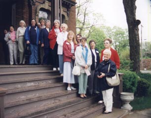
The Branch County Art Guild is active in Southern Michigan. The Guild welcomes new members, and is actively promoting the arts with open and free exhibits to the public, Guild meetings, events, and projects that also benefit the community. Please enjoy the journey through our website with the links on this page, and be sure to go on the gallery hop which is an online exhibit of some of the artwork of our members. If you are a local artist, or just someone who likes to dabble and have fun with art, you are welcome to join us...we are open to new members.
You can contact us by telephone: 517 278 4636.
Please leave a message
Or contact us by email:
History of the Branch County Art Guild
The Branch County Art Guild was originally formed as the Coldwater Art Club in 1954 with twenty-six members. The Jackson Art Club was helpful in the organization. The name was changed to Branch County Art Club in 1996 to more accurately represent the current membership. Its purpose has always been the promotion of interest in art, as a form of recreation, to encourage self expression and to educate.
Much of the early interest in the club is attributed to Hazel Houghton who gave lessons to many of the early members in her basement studio.
Self expression has been encouraged through painting workshops, instructional demonstrations, lectures, discussions, critiques, and through mutual association.
Sharing works of art with the community has always been a goal of the club. Many local businesses have welcomed the exhibit of paintings: banks, libraries, Kellogg Community College, the county 4-H fair, Tibbits Opera House, senior centers, and others.
More information on the history of the club is available in History of Branch County, Vol.1, 1997, published by the Branch County Art Guild historian Eleanor Shaw.
Purpose
The promotion of interest in art
Recreation
To promote education through lectures, discussion, and mutual association
To encourage and promote exhibits
Membership Requirements

Any person interested in creative arts and wishing to join, will be accepted as a member after paying the annual dues of $10.00. No vote is required. Members must pay their dues by November 30th to remain a member in the following year. If dues are not paid, all rights and privileges will be discontinued.
By Laws (revised. 2024)
A. The By-laws are to be reviewed at the first meeting (March) of each year.
B. Meetings are to be held on the second Thursday of each month, beginning in March through November.
C. The Board of Directors will meet as designated by the President. All officers are members of the Board.
D. The President calls the meetings to order. The President may appoint any member, in good standing, to be on a committee or fill any vacancy on the Board.
E. The Vice President will conduct the meeting in the absence of the President.
F. The Secretary will keep the minutes of all meetings, prepare and send all correspondence.
G. The Treasurer will collect all dues and notify members if their dues become delinquent. The Treasurer will pay all bills, prepare and file tax documents.
H. The year will begin with the March meeting. Dues are collectable from September through December for the following year. Dues are $10.00 per year. Dues may be waived at the discretion of the board.
I. The Program Committee will consist of the Board of Directors.
Branch County Art Guild Mission Statement
Bulletin Board for the Guild*
* If you have a message to post on the bulletin board, please email it by using the link below. Thank you.
If you would like to be considered for the Artist of the Month award, please fill out the Artist of the Month form and bring it to one of the meetings along with 5 clear photos of your art, and one of yourself. Ask the President to get the form and photos to Kathryn Barnes for inclusion in the website.
I
f you would like to be on a committee to research and develop an art center
and other projects in Branch County, please attend one of the guild meetings or the Downtown Business Association meetings, and express your interest.
List of Members of the Branch County Art Guild
Please sign our guest book, we'd love to hear from you!
Art Tips
5 TIPS FOR RECOGNIZING YOUR PERSONAL STYLE
By Scott Burdick
Take chances.
Follow the thread of your interests wherever they may lead, no matter how impractical or unrelated they may seem at the time. It's a good sign when you have no idea what the end will hold.
Study your work.
Learn to recognize what has worked and thank your lucky stars, but don't get complacent. Search out your mistakes and constantly strive to improve.
Tune out the rest of the world.
The struggle for self definition can only be fought from within. You must have enough confidence to ignore both compliments and criticisms if they run contrary to the vision your imagination hold up before your eyes.
Never consider whether or not the subject will be "saleable."
Regardless of how "hot" a particular subject is at the time, if it stirs no emotion within you to start with, it will never come to life for you matter how technically well done it is. If, however, you're genuinely excited about a subject, you're bound to find someone else who is as well.
Don't avoid subjects you've seen someone else do.
Through the long history of art, just about everything's been done and redone. If you're true to your vision, your rendition can't help but reflect your unique viewpoint.
One of the toughest parts of being an artist is learning to strike a balance between the demands of your daily life and the private time necessary to develop your own personal vision.
Break Out of a Painting Rut
By Scott Burdick
Your job as an artist is to strike a balance between the interaction with the world around you and the private time necessary to develop your own personal vision. This approach will allow you to draw inspiration and understanding from the infinite variety of nature, while letting your connect with your unique, inner creativity. This mixture of opposites will be different for every painter and every painting. If you find yourself in a rut, try experimenting with the mix. If you've been operating in isolation for a while, maybe you need more outside inspiration. Conversely, if everything you paint seems to come from some external source, consider letting your imagination be the guide for a while. If your paintings seem to be repeating themselves, then get out your sketch pad, French easel or camera (Sargent used to go outside, set up and simply paint whatever randomly happened to be directly in front of him as a break from his extremely thought-out commissions.)
If you're feeling you're simply "copying" reality, lock yourself in the studio with nothing but your brushes and see what evolves. (Leonardo da Vinci sometimes got ideas for paintings by staring at cracks on a wall, thus freeing his eyes from the literal and allowing his mind to fill the abstract patterns with images from internal sources.)
No two artists will approach a painting in exactly the same way. This is both the wonder and challenge of making art.
This article is from the online magazine www.watercolormagic.com
Many online art magazines offer regular subscriptions and free email updates including art tips.
4 PLEIN AIR PAINTING TIPS from the Artist's Magazine:
With spring finally here, it's time to get out of the studio. Here are the thoughts of four plein air artists on painting outdoors:
Joseph Paquet: "Plein air painting forces you to simplify. You have to establish a hierarchy of what's important and what needs to be subordinate. When I'm working outdoors, I always start by freezing the effect of light by locking the shadows in place at the proper value, character and shape."
Mary Deloyht-Arendt: "I'm more inspired when I paint outdoors it's very stimulating. You see so much more on location than you do when working from photographs, and you get a much better understanding of shapes, forms and colors."
Peter Adams: To "get the feeling of the light," he squints his eyes to move the image out of focus. Then he covers his paper with large, general masses of color. "I'm always thinking about my highest value, my brightest, more intense color. Then I start to refine things, moving all over the surface rather than finishing one section at one time."
Joan LaRue: To increase the enjoyment of working outdoors, pare your equipment down to what you need, not what you want. Beyond the materials, your success outdoors may come down to determination and the willingness to take risks. "Don't say, 'I can't do this,'" she advises. "Don't let fear of the unknown and fear of failure keep you from reaching out."
For more on painting outdoors, see A Passion for Plein Air in the May issue of The Artist's Magazine.
6 Tips for Creating Abstract Art
Abstract art is difficult, confusing and downright strange, but it can do wonders for your artistic imagination.
By Tom Zeit
Abstraction isn't the most popular artistic mode around. Sure, it has a loyal (and growing) group of practitioners, and it makes up a large portion of what's hanging on the walls of fashionable New York art galleries. But many artists and appreciators tend to keep their distance, perhaps because they're intimidated by it or because they don't trust those snooty galleries. More likely, however, they haven't had much exposure to abstract art, and as a result they just don't know what to make of it.
But that's a shame, because those who shun abstract work are missing some of the most exciting and expressive artwork there is. Of course abstraction presents a distinctly different way for artists to convey their ideas, but that's not all. It also expands your imaginative abilities, because it forces you to think about your ideas in ways that don't mimic the objective world, and it requires you to see in unfamiliar ways. There's no better way to exercise your imagination than to set it free from the boundaries of our everyday visual experience.
Look inside, not out. Instead of turning to your surroundings for images to depict, concentrate on your own feelings and experiences and see what they suggest.
Visit the masters. As an exercise, break down a masterwork into individual shapes, ignoring the details, to get a sense of how the picture is composed. Redraw the shapes yourself (or assemble them in paper), then try rearranging them altogether.
Start in black and white. For beginners at abstract work, it's often easier to concentrate solely on shapes and composition before moving on to working with color.
Focus on space. First and foremost, the abstract artist has to deal with the arrangement of space. Try to see each element as a part of the overall balance.
Make it big. When artists lack confidence, they tend to work small. Don't be afraid to start with big shapes so you can stand back and evaluate them.
Doodle. Whether on paper or in clay, whether completely open-minded or with a vague idea in mind, begin with simple doodling and you'll get a glimpse of where your ideas might lead.
This feature is also from the Artist's Magazine online at:www.artistsmagazine.com or a magazine subscription can be ordered through the guild with a group savings rate.
Tips from Bill Williams, artist:
Draw and paint from life
Five important elements in art are: Light, Shadow, Cast Shadow, Reflected Light, and Negative Space.
Cast shadow is darker than a shadow on the object in a still life
Use a mirror to look at the composition
Leave the darkest and lightest areas to the end in pastel
Measure and draw for accuracy. It is important to start off right, harder to do over and correct an artwork later.
Try mixing your own gray tones from complimentary colors
Sap green and alimazon crimson make a great brown
Alimazon crimson and ultramarine blue or raw umber and ultramarine blue make good darks.
Don't sign an artwork too soon, but go back and perfect it
In landscapes, leave some details out of the shadows if the artwork is too busy, focus on the contrasts by squinting your eyes to see the image you are looking at, and your artwork.
A dark backdrop will help highlight a lighter object
Use good materials
Artist Susan Miller gave a Life Drawing class to guild members May 8, 2003.
Here are some tips from the class:
Practice by tracing figures in magazines, using a few strokes to designate form, will aid in adding figures to paintings.
The Axis line, or center/focal point in a figure should be integral to figure drawing.
Figure drawing is the translation of a three dimensional image to a two dimensional surface.
Try to utilize the whole paper in figure drawing, and try to use big sheets of paper.
Use a Kabob stick to measure, because it is more accurate than a pencil. A transparent window grid can also be used.
Check both horizontal and vertical lines when measuring.
Always start with gestures, warm ups, 90 percent looking and 10 percent drawing.
Draw everyday, even if it's only 10 minutes.
"Artists draw not because they can, but because they must"
For Online Tips of the Week see: http://www.artistsmagazine.com/tam_tip.asp
Create Contrasts With Complements
In 1839, chemist Michel Eugene Chevreul published his book On the Harmony and Contrast of Colors. In it, he argued that the brightness of colors didn't only depend on the strength of their dyes. Some colors' intensity diminished when placed next to another: hence, the law of "simultaneous contrast." To achieve maximum color contrast, place complementary colors side by side.
Complementary colors are any two colors of the spectrum that, combined in the right intensities, produce white or nearly white light. For example, red absorbs green (blue and yellow), yellow absorbs violet (red and blue) and blue absorbs orange (red and yellow). The final color would be white.
Color expert Nita Leland advises her students to differentiate between complements and near- or close-complements: "Placed side by side, true complements enhance each other and may appear to vibrate. When mixed, they neutralize or gray each other. Both effects depend on whether the colors are true complements. If the color vibration isn't quite as intense as you expected, or the mixture turns out to be brown instead of gray, your colors are probably near-complements."
SKETCHY SITUATIONS
Use these sketching dos and don'ts to guide your work.
1. Don't worry about making mistakes. "I strongly urge you to work in pen and ink, not pencil," says artist Keni Davis. "Initially you may struggle with not being able to make corrections or undo your work. You may even be tempted to tear a page out of your book because the sketch didn't work out exactly as you expected. But if you're bold in your approach and not overly concerned about little details that don't measure up to your expectations, you'll find that as you continue to work in your sketchbook, you'll look back on earlier pages and discover you've made great progress."
2. Do work in public as often as possible. "It's a great confidence builder to have people openly admire your efforts as you sketch," Davis says. "On those rare instances when someone offers criticism, refuse to be offended; the experience will help you grow."
3. Do get something down on paper quickly. "The sight of a pristine sketchbook can be terribly intimidating," says artist Alice Kale. "Once you get a few things down, including the inevitable mistakes, it's much easier to work."
4. Do sketch regularly. "Learning to draw takes time and practice, and no effort to learn is ever wasted," says Kale.
5. Don't let your sketches get out of control. "Use a viewfinder to narrow the scope of your subject," says artist Cecy Turner, "then draw boundaries (a frame) on your paper before you start. Try to fit your composition into that frame. Otherwise, your drawing can grow and grow, and you won't know where to stop."
6. Do make several thumbnail sketches of the same scene with different horizon lines or from different viewpoints. "Making several different thumbnails will sharpen your creativity, and you might even end up with a better composition than your original idea," says Turner.
GET YOUR ARTWORK NOTICED
AND GET WELL-DESERVED INK
As a former Los Angeles Times columnist and a marketing consultant for artists and art schools, Mary Carroll Moore has learned what works—and what doesn't—when promoting yourself as a pastel painter. Successful artists, who get interviewed regularly and whose work is widely known, often have one essential item on hand: a marketing package. This package is a collection of written and visual materials that show off an artist's accomplishments, availability for commissions and shows, and the unique niche the artist's art fills.
Using this type of marketing package, Moore has secured features for her clients in national art magazines and other media outlets. And it's not just journalists and art magazine editors who need to know you. Galleries often ask for this information as well, and most artists scramble to put it together at the last minute. Why not do it now? Then you'll always have a press package on hand, ready to send whenever you want to expand your art business.
Here are seven items that Moore says are must-haves in the package:
Brief cover letter (customized for each recipient)
Artist bio or professional resume (one to two pages)
Artist statement (one page)
One or more full-color postcards or greeting cards of your paintings
Business card with your name and studio phone number
Selection of 10 to 20 images (slides in sleeve or CD slide show)
For media (interviews) add: 5x7 black-and-white head shot
Juror's inside scoop:
"Generally there are three reasons a painting is not selected:
There is evidence of one of the following: a lack of drawing skills; random use of color rather than a knowledgeable or original approach; reliance on gimmickry; or lack of control of paint, shape or edge by accident rather than intent.
The work is too derivative of a source (a teacher, a cliché, another artist's work, a photograph, etc.).
The slide is of poor quality (bad lighting; extraneous matter included in the frame such as the mat or a wall; bent, taped or overly thick slide) so that the work couldn’t be judged adequately.
About Paper Purchasing
Michelle Taute explains how you can make your next trip to buy paper more productive with these five simple tips:
Be prepared to talk about your style and technique. It’s more helpful for a salesperson to know that you use broad, expressive strokes than that you paint realistic landscapes.
Touch as many different papers as you can. “We advise people to go with their gut instinct or first impression,” says Katherine Hyde, a manager in the paper department at New York Art Supply. “It’s almost always right.”
Buy three different kinds of paper and give them each a test run. “It’s important to forget the expense,” Hyde says. “Don’t be afraid to experiment before going into your first masterpiece.”
Make sure the paper you choose is acid-free. This will help ensure that your artwork ages well. Inexpensive paper isn’t a bargain if it means your painting surface prematurely yellows or deteriorates.
Read the description on the paper package. “It will tell you the specialty of the paper,” says Mario A. Robinson, an artist in Lakewood, New Jersey. He recently tried a new stark-white paper, for example, that’s extremely bright. Its ability to reflect light helps him achieve a background glow
Watercolor Tips
experienced teacher can help you get the most out of this wonderful medium. After 20+ years of watercolor painting experience, Joe Garcia has learned more than a few tricks of the trade. Here are some of them:
Palette Trick: A new plastic palette may resist paint. Use steel wool or a very fine sandpaper to buff the mixing area.
Salt Controversy: When salt is used on a watercolor paint-
ing, the pH level of the paper is slightly lowered when salt dissolves and is absorbed into the fibers. Some believe that salt shortens the life of the paper and consequently the art.
Painting Clouds: When painting landscapes, remember that a cloud has a top, a bottom and sides--and it casts a shadow.
More Realistic Skin Tones: When painting portraits, use warmer color mixtures for the cheeks, nose, eyebrows and chin. Blood vessels are closer to the surface in these areas.
Mixing Colors Without Granulation: Directly mixing a warm primary with a cool one might cause granulation or uneven mixing. Instead, try glazing one of the colors over a dry wash of the other color.
Website Mastership
In the Business column Marques Vickers explains that the Web is a powerful sales tool for artists, but only if used effectively. He gives six ways to maximize your online presence:
Personalize your Web site. There are millions of artists worldwide, so the more you can communicate a personal vision of your art—your unique story—either verbally or visually online, the better.
Exhibit your art wisely. No matter how clear and detailed your image is, it will lose much of its definition once it’s displayed on your Internet page, so design it wisely and be sure that whatever background you choose flatters your work.
Make sure your site loads quickly. Your initial page should serve as a contents page, so it should load on viewers’ screens within eight seconds or less.
Keep it fresh. Update the content on your site routinely, which will give people a reason to return again and again.
Make your site easy to navigate. Make sure that your links actually connect to where they are supposed to and your viewer doesn’t have to waste too much time figuring out the focus and contents of your site.
Allow for interaction. Adding a guest book, message board, blogging mechanism or response forum to your site often extends the time a viewer stays on a Web site and motivates a return visit.
MASTERING COLOR
By Vicki McMurry
More than any other tool at your artistic disposal, color has the potential to command the eye, quicken the pulse and elicit a response from your viewer. Here are a few color tips I’ve discovered in my own quest to master color:
White-- When you mix Titanium White directly with another pigment on your palette, the resulting mixture frequently has a bluish cast. If you don’t want this, try glazing the other color over the white instead. I frequently do this when painting clouds.
Yellow-- Cadmium Yellow Light has a cool temperature. When surrounded by warm colors, this coolness vibrates. You can exaggerate this vibration by darkening the surrounding colors a notch. This will help make the yellow pop.
Orange-- I prefer lightening my darks with oranges instead of reds or yellows. Red is rarely light enough, but yellow is frequently too much of a leap. Orange is light enough and provides a warmth I instinctively gravitate toward.
Green-- Some time ago, galleries were telling artists that green paintings didn’t sell. This may have been because decorators were also avoiding green. Since then, greens have made a comeback. Cutting an entire color from your palette to adhere to fashion is a risky thing to do; it’s best to understand color and use it when it speaks to you.
PICTURE-MAKING TRICKS
by Bert Dodson
Human beings are natural storytellers. We make stories out of virtually everything, including our own lives. Storytelling is a method we use to make sense of the world, as well as a point of deep access to our imagination. Part of the work of the imagination is to surprise us. We start drawing a character or two, and they begin to tell us a story—we get pulled into a drama of our own making. We look at our picture and wonder what might happen next. So as we create, we are sometimes the storyteller and sometimes the audience. This is a useful strategy, a trick really, for making pictures that tell tales. Here are a few others:
Stories are told through the orchestration of elements: Establish a hierarchy of importance among the elements in your picture. You make something important in a variety of ways—size, contrast with other elements or degree of sharpness and/or detail.
A good story leaves some things unexplained. By “unexplained,” I mean using such visual devices as obscuring, distorting, juxtaposing in odd ways or radical cropping. These devices require the viewer to actively fill in the gaps with his or her own imagination.
Believable fantasy is grounded in authenticity. Some realism in a drawing allows the viewer to more readily accept the fantastic elements.
Details enrich a story and make it more real. A select few details are crucial to the story, while enrichment details add believability and interest.
The anticipation of an event is sometimes more intriguing than the event itself. Consider depicting an event at the moment before the main action actually happens.
Art Guild Exhibits, Meetings, Projects and Events
2001:
November: Eleanor Shaw
December: Bev Tippmann
2002
January: Deborah Morris
February:Lauree Manzer
March: Beatrice Wickwire
April: Mike Hillyer
May: Kathryn Barnes
June: Theo Parker
July: Ruth Bidwell
August: Elaine Risedorph
September: Donna Good
2003
August: Estelle Fisher
2004:
February: Jean Hulliberger
2005:
April: Vi Garman
2010:
April: Jean Brorby
2023:
September: Vi Garman

Welcome to the Branch County Art Guild Online!

web design © Kathryn Barnes, webmaster


"2026 Program & Event Guide"
Thursday, March 12th at 6:30 p.m. “Florals” with artist Kathryn Barnes. Bring your art supplies"
of choice. We will be painting a beautiful floral arrangement provided by the guild.
Thursday, April 9th at 6:30 p.m.*** “Painting Birds in Watercolors” with artist Vivian Shilling.
Thursday, May 14th at 6:30 p.m. “Painting on Hard Surfaces” Presented by Jean Brorby.The guild
will provide slate. Please bring your own acrylic paints and brushes.
Thursday, June 11th at 6:30 p.m.“Watercolor Painting” with Judy Houk, artist and President of the
Angola Watercolor Society. She will share her expertise. Bring watercolor supplies for this class.
Thursday, July 9th at 6:30 p.m.***Jean Brorby will present “Coaster Painting”. Bring your acrylic paints and brushes. You may wish to bring some rocks to paint and reference materials. The guild will provide a coaster to paint.
Thursday, August 13th at 6:30 p.m. “Watercolors’ Paint with artist Pat Asbury. Bring your own
watercolor supplies. Subject TBA.
Thursday, September 10th at 6:00 p.m. “Next Year’s Blossoms” Artist Carl Mosher will provideall of the materials needed for this class. $10 supply fee as Carl provides the paint and canvases. RSVP.
Thursday, October 8th at 6:30 p.m.*** “Autumn Plein Air” Kathryn Barnes will give an update on the plein air paint outs highlighting interesting moments. Please bring art supplies & your plein air paintings to show. Weather permitting, we will go outdoors and paint the scenic autumn landscape surrounding the church. Bring reference material if painting indoors.
Thursday, November 13th at 6:00 p.m. “Annual Harvest Dinner”. Bring a dish to pass and a gift"
"to exchange (Under $10 or handmade). Let Peggy know what you are bringing (Salad, dessert, main dish etc.) so we can balance it out. Bring your own table service. The election of officers for 2027 will be held and dues for 2027 should be paid by November. Come and enjoy the fellowship of your fellow artists!"
"FOOD, FUN AND FELLOWSHIP!"
Location: Northview Christian Church, 539 Union City Rd., Coldwater, MI.
Artists are encouraged to bring recent artwork to show to the group and the challenge painting for the month.
*** Bring paintings for SMB&T to these meetings.
EXHIBIT LOCATIONS
Branch District Library ( 7 paintings)
10 E. Chicago St. - Coldwater ph: 517.278.2341
Century Bank & Trust ( 1 painting)
100 W. Chicago St. - Coldwater ph: 517.278.7311
KCC (Grahl Center) ( 55 paintings)
125 Seeley St. - Coldwater ph:517.278.3300
Southern Michigan Bank ( 14 paintings)
225 N. Broadway - Union City ph; 517.741.4281
OFFICERS
PRESIDENT: Jean Brorby
VICE PRESIDENT: Kathryn Barnes
SECRETARY: Vi Garman
TREASURER: Dorothy Cross
COMMITTEE CHAIRPERSONS
Webmaster: Kathy Barnes
Exhibit Chair: Dorothy Cross
Social Media/PR: Kathy Barnes & Peggy Voss
Hospitality Chair: Dorothy Cross
Photographer: Darlene West
EXHIBIT CONTACT PERSONS
QUARTERLY EXHIBITS - Branch District Library,
Century Bank, Burnside Center: Dorothy Cross
KCC/GRAHL CENTER: Peggy Voss
SMB&T UNION CITY: Jean Brorby & Tom Garman
MEETING PLACE
Northview Christian Church
539 N. Union City Road Coldwater, MI 49036
Members (Past and Present)Linda Anderson, Pat Asbury, Kathryn Barnes, Beverly Benne, Diane Betts, Ruth Bidwell, Linda Black, Mary Blosser, Joyce Bowerman, Joyce Bayles, Christy Berry, Diane Betts, Sally Brayton, Jean Brorby, Rosie Chard, Dorothy Cross, Evelyn Cross, Janice Crum, Chris Danley, Janelle Dixon, Karey Farrell, Estelle Fisher, Tom Garman, Vi Garman, Maxine Hawkins, Bill Heidenreick, Mike Hillyer, Mabel Hough, Jean Hulliberger-Brorby, Judy Houk, Cheryl Good, Donna Good, Vera Luce, June Lunn, Arlinda Hall, Arlene Harsh, , Karla Heminger, Thelma Heminger, Adabelle Hill, Robert Hinburn, Sharon Hoover, Mabel Hough, Judy Houk, Sandra Humphrey, Fran Hurst, Nancy Kensill-Grubb, Karman Kwiatek, Carol Kipfer, Travis Klotz, Ralph Largo, Diane Liebenthal, Vera Luce, June Lunn, Sherrel Mack, Lauree Manzer, Darla Miller, Deb Morris, Sharon Myers, Gloria Norris, Doreen Palmer, Theo Parker, Vera Paul, Victoria Protasona, Susan Purviance, Julie Putnam, Annie Quaak, Arny Reger, Philip Rice, Elaine Risedorph, Vivian Schilling, Linda Schrock, Eleanor Shaw, Kayla Shaw, Jeanne Smiertka, Lou Stuckey, Beverly Tippmann, Susan Thompson, Beth Topham, Gini Toth, John Toth, Tami VanAuker, Estel Voss, Peggy Voss, Petite Wade, Darlene West, Cindy Whitney, Beatrice Wickwire, Peggy Yarger, Rosetta Young.
Honorary Lifetime Members
The Guild has awarded Rosie Chard the Honor of its first Honorary Lifetime Member in 2002.
2003: Estelle Fisher and Vera Luce
2006: Adabelle Hill
2026 Eleanor Shaw
In Memory of artists we treasure, love & remember......Art guild members we feel
fortunate to have known. Thank You!
Members: Here is the form to
use to apply to be the
"Artist of the Month"